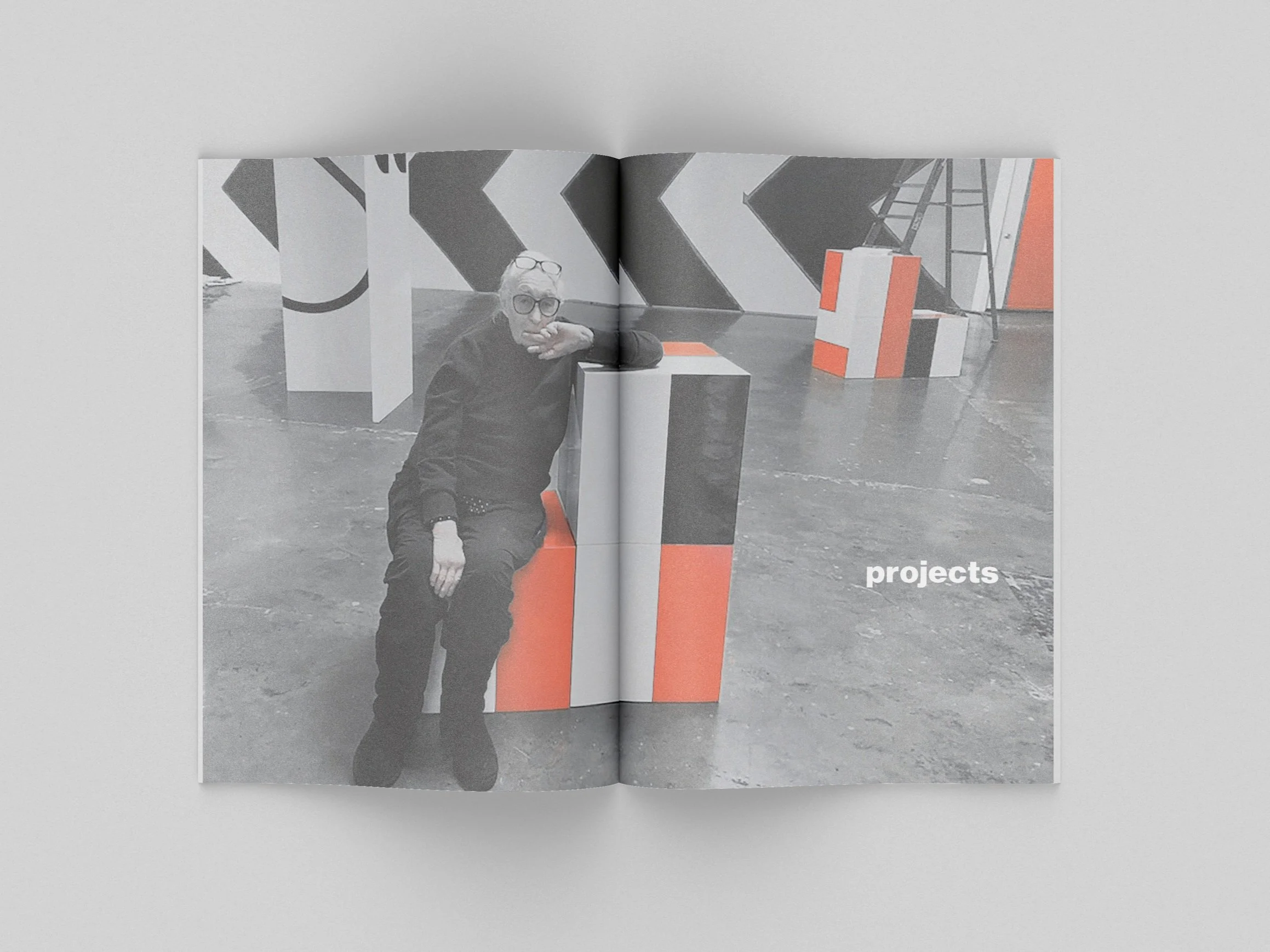
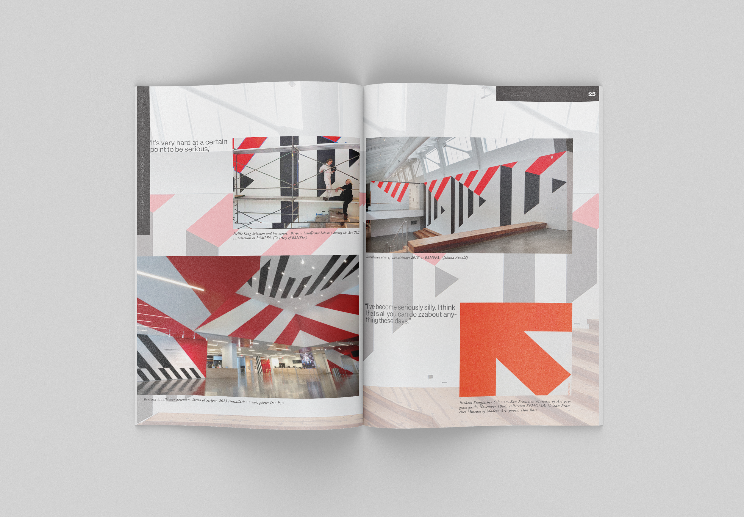
Designing a book about Barbara Stauffacher Solomon meant creating engaging visuals that echoed and complemented her work without overshadowing it. The challenge was to design spreads that highlighted her art while offering a fresh perspective. Inspired by Barbara’s outlook on art and her bold, graphic style, I approached the layout as an homage to her iconic ‘Supergraphics,’ with the cover and title page serving as a subtle nod to that legacy. Reds and blues were emphasized throughout the photography, and the layout became an exercise in balance—paying tribute to the artist while staying true to my own design sensibilities, all while keeping her work at the center. This project pushed me to think critically about pacing, hierarchy, and how design can support storytelling without taking over. The result is a book that feels as layered and intentional as its subject: a visual tribute that invites the reader to look closer.